


Over the years, fashion statements have evolved so much that they have made some remarkable changes to our history. Part of fashion’s important aspects is colour, the art of making a colour and the significance it holds determines its value. Nowadays, most colours run at similar prices, and it is the pattern or design to a garment that raises its price; however, this wasn’t the case many years ago.
Colour dates back nearly 75,000 years ago, the first appearance was early humans using ochre for body decoration and painting of grinding materials. Ochre was made from a combination of chalk, soil and animal fat, giving rise to the base palette of colours: black, white, yellow, red, brown. This pigment’s first sighting is said to be in a cave at Twin Rivers, near Lusaka, Zambia.
Colours were more than just pigments, they were symbols of status, gender, symbolism and representation, associations and more. Red was the first to be named after black and white, pink was originally for young boys as a preface to the masculine red, and girls wore blue because of Virgin Mary’s cloak. Green represented feelings like envy and jealousy but later was used in an array of stuff, nearly everywhere for a period. Purple was a dominant colour and influenced many like Cleopatra, and Julius Caesar.
And, although a colour’s background or saying that it has feelings attached to it seems mystical, research on the effects of colours on our brains shows that it wasn’t always just the imagination of their minds.
One study from 2020 that surveyed the emotional associations of 4,598 people from 30 different countries found that people commonly associate certain colours with specific emotions. According to the study results,
The year was 1775, a curious chemist mixed up sodium carbonate, arsenious oxide and copper sulphate, leading him to a wonderful, deep, shade of green. Present moment? Doesn’t sound very amusing. To the Victorians? This colour invented by the German- Swede was everything. Why you ask, well firstly, all greens prior to this had been a rather yellowish or brownish hue, never achieving the true green. Slight problem though, arsenic, was a poisonous chemical and was even used to kill rats. And they knew this. Carl Vilhelm Scheele knew this, even writing it in a letter to a friend, A possible reason for ignoring the harmful effects is that arsenic poisoning did not affect everyone, a rather strange disease, and so, it was more of a hit-miss situation.
They started using it in everything. Clothes, wallpapers, toys, cutlery, furniture, and even food! Were now in this emerald shade of green. Perhaps, the feeling of contentment as researched previously was another reason why the people were in love with the colour.
The Industrial Revolution had led to there being a blanket of smog and greyness filled the air. This could be yet another reason why Scheele’s Green persuaded people. The fumes released from this paint, if exposed went into your lungs and caused throat infections, coughs, runny eyes and even diarrhoea and in some bad cases, cancer.
Anyhow, the consequence of the usage was dire. One of the most famous cases was of a young girl, 19 years old- Matilda. She worked in a factory where this paint’s dust was used to brush off leaves to make them more “alive”. She was said to have spat up green vomit, her eyes were green and said she saw everything in green
Napoleon’s death on the islands of Saint Helena (while exiled) is believed by some to be caused by poisoning of this very colour. Although he states that the British tried poisoning him which led to his stomach cancer his bathroom and bedroom wallpapers were laden with this colour and when he’d have a shower, the dust from it would evaporate and then be inhaled by Napoleon.
Similar is the case of a woman named Claire, who was an ambassador to Italy. Her ceiling was painted in this colour, leading to her death as well.
Eventually though, the Parliament got involved and set regulatory acts on how much arsenic could be put in food, clothing, etc. It had been long since something like this had happened, and finally, like most trends, it died off.
Fun Fact: the term “drop dead gorgeous” is believed to have stemmed from the usage of Scheele’s green as a dress, because it could literally kill you!
Rare colours were considered extremely valuable, even surpassing the value of Gold. These infrequent shades were doted on by the royals and upper class, because it was expensive, in a way, a collectible and not everyone (especially the common man) couldn’t have it.
The art of pigmentation often never left the hands of the creators themselves and was at their discretion.
Tyrian purple is a pigment made from the mucus of several species of murex snail. The ones who loved this colour the most were the Phoenicians and it was sacred to them. This colour was used for trading in the middle class, members of higher society were often depicted having these colours, Julius Caesar’s Toga picta was said to be pigmented in this colour. The “Phoenicians” literally translate to the land of the purple. They were probably the first to equip themselves with it in 1570 BC.
The die was so valuable because the colour did not easily fade. In fact, it did the opposite. In the face of weathering and sunlight, this “royal purple’ stood out even more brightly. It came in various shades, the most prized being that of black-tinted clotted blood. By the fourth century AD, sumptuary laws in Rome had been tightened so much so, that only the Roman emperor was permitted to wear Tyrian purple.
As a result, ‘purple’ is sometimes used as a metonym for the office (Ex. the phrase ‘donned the purple’ means ‘became emperor’).
Fun Fact: In the 9th century, a child born to a reigning emperor was said to be Porphyrogenites (born to purple).
This last royal colour in my research is Ultramarine Blue, and unlike the rest which are made from parts of things or elements, this hue comes from semi-precious mineral Lapis Lazuli. And before the 1800s, it was used to make ultramarine-blue, well blue.
And even earlier than that it made its way (as a stone) on the jewellery, sculptures and ornaments of Bamiyan, Afghanistan, and we can see this depicted in a cave in Afghanistan. From Afghanistan, Lapis were traded across the world through a network; Afghanistan to Syria, by the Silk Road, then Syria to Venice and then Venice to pretty much all of Europe and European merchants and artists used it too.
It was common to see it on the paintings of high value like Virgin Mary’s very own painting. And Bacchus and Ariadne. It was like a symbolism for purity and divinity as it adores the robes of many in religious paintings.
And so, like all rare pigments it too, became a symbol of wealth and status. Partly because of its symbolism and other part because it was an extensive work of art to make it in the first place. If it wasn’t the purest form the colour would end up as a sad greyish tone. It was first coated; layers of wax, oils, resins and then kneaded to form a dough. The dough then goes right into a lye solution, and blue flakes would then separate from the lye solution. Then, finally, blue flakes would separate from the lye solution thus creating a blue powder.
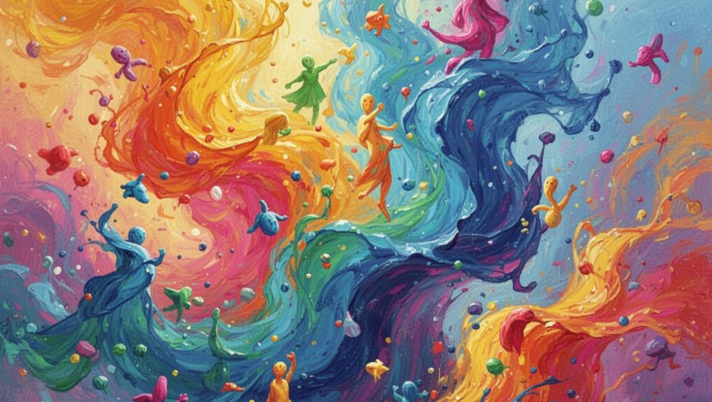
This article explores the fascinating history of colors, revealing how they shaped fashion, symbolized power and wealth, and, in some cases, proved dangerously toxic.
Many pigments were difficult and expensive to produce. Rare colors like Tyrian Purple and Ultramarine Blue became symbols of royalty, wealth, and prestige because only the elite could afford them.
Scheele’s Green was a vibrant green pigment invented in 1775 by chemist Carl Wilhelm Scheele. It contained arsenic, making it highly poisonous despite its popularity during the Victorian era.
The pigment released toxic arsenic fumes that could cause respiratory illnesses, eye irritation, stomach problems, and even death after prolonged exposure. It was commonly used in wallpaper, clothing, toys, and household items.
Some historians believe prolonged exposure to arsenic-containing wallpaper in Napoleon Bonaparte’s residence on Saint Helena may have contributed to his declining health, although this theory remains debated.
Tyrian Purple was a rare dye extracted from the mucus of murex sea snails. It was one of the most expensive dyes in history and became closely associated with emperors, kings, and the Roman elite.
Its production required thousands of sea snails, making it extremely costly. Roman laws eventually restricted its use so that only the emperor could wear garments dyed entirely in Tyrian Purple.
Ultramarine Blue was traditionally produced from the semi-precious gemstone Lapis Lazuli, primarily mined in Afghanistan. Its rarity made it more valuable than gold during certain periods.
Artists reserved Ultramarine Blue for the most important subjects, especially religious figures like the Virgin Mary, because it symbolized purity, divinity, and wealth.
Throughout history, specific colors represented authority, nobility, religion, and prestige. Wearing rare or expensive pigments often reflected a person’s rank and influence in society.
Research suggests people often connect colors with emotions—for example, red with love, blue with relief, green with contentment, black with sadness, and white with peace or relief.
The article shows that colors are much more than visual beauty—they have shaped history, influenced fashion, reflected social status, inspired art, and even posed serious health risks.
You can buy the books at Bookosmia and Amazon.
https://www.amazon.in/dp/816855552X
Voices of Play: A National Play Manifesto By Children, Of Children and For Every Caring Adult is a Bachpan Manao Collabaction by REACH India Collective, Shiksharth, and EkStep Foundation. Published by Bookosmia. Contributors: Deepika Mogilishetty, Ashish Shrivastava, Archana Mohan, Keren Sam, Samyuktha Udupa. Made possible by 22 partner organisations who captured the voices of over 4,000 children across 10 states. Does Play have a voice? What does Voices of Play mean? Across ten states and shaped by over 4,000 children, Voices of Play is a joyful window into the world of play told by children themselves. Brought to life with the support of 22 organisations, achored by Ek Step Foundation’s Bachpan Manao program, it gathers stories, games, and memories from anganwadis, community spaces, preschools, and classrooms—capturing a rich tapestry of childhoods and the worlds of play around us we may have never noticed before. With artwork recreated from children’s own drawings and moments captured from the field, this book, published proudly by Bookosmia (smell of books) is made with children, not just about them. Built on their trust, it celebrates play as imagination, memory, and a language that belongs to every child.
***
This article is published by Bookosmia, India’s #1 publisher for and by young people. Bookosmia publishes stories, books, podcasts, events, TED-Ed talks, workshops, bedtime stories and more related to kids and young adults.
Photo Credit – AI generated images from Chat GPT and Magic Media from Canva .
Want to publish your articles, reviews, stories, audio stories, bedtime stories and poems ?
Did you know that children can submit audio stories to be turned into Bedtime Stories and published on Bedtime Stories – A Podcast by Bookosmia?
Write to us at sara@bookosmia.com or submit your article at the link below
Get Published


One Response
Heartiest congratulations on your first blog! 🌸 It’s incredible to see your curiosity and confidence at just 12. ‘The Secret Lives of Colors’ is such an interesting choice of topic. Keep exploring, writing, and inspiring everyone around you. Wishing you many more milestones ahead!